





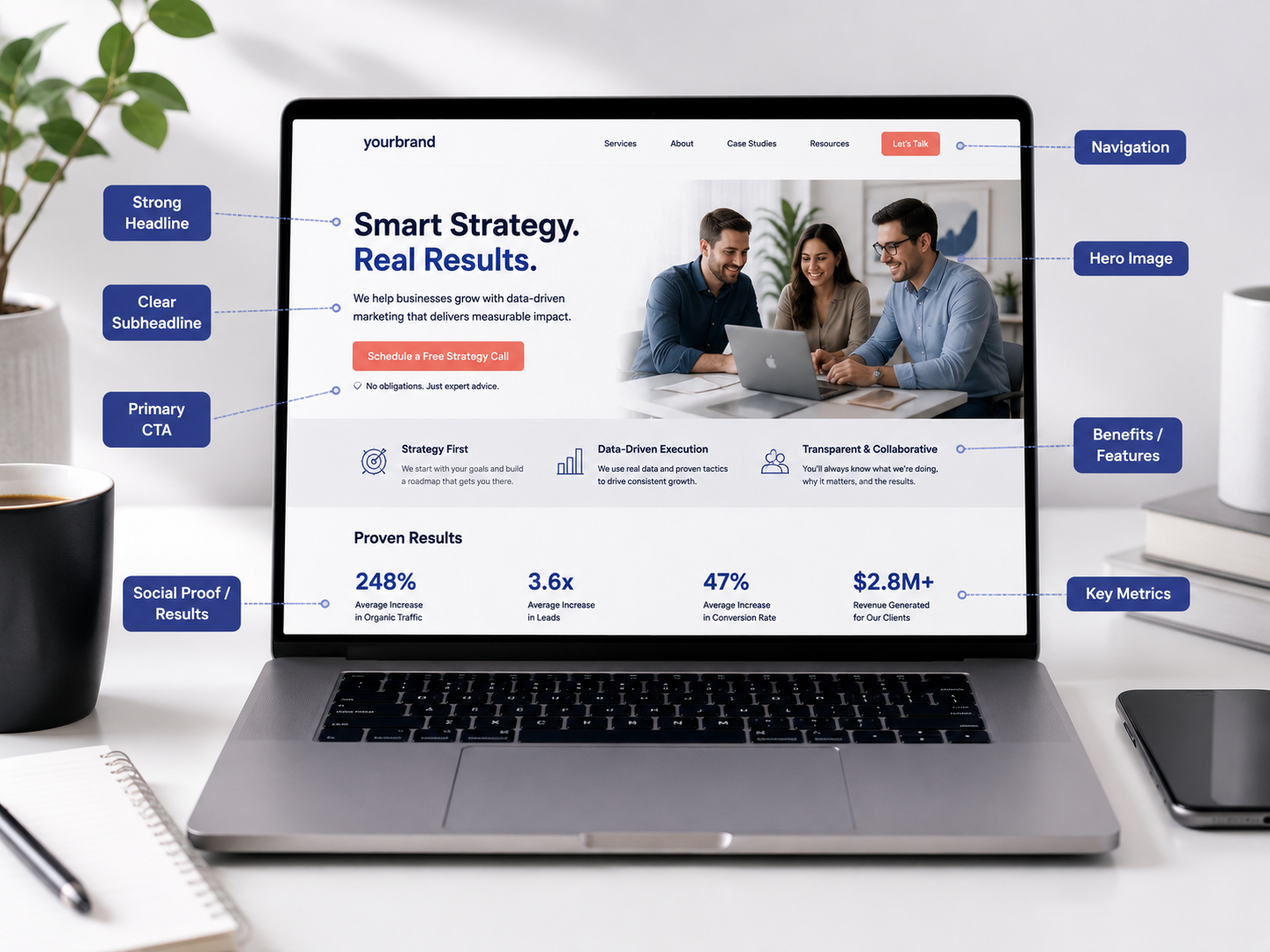
High Converting Landing Page: Turn Clicks Into Leads
A high converting landing page does not win because it looks flashy. It wins because the page makes the offer clear, answers the visitor’s biggest questions, builds trust quickly, and makes the next step feel easy. For service businesses, that next step might be a call, form submission, consultation, quote request, booking, or demo.
What Is a High Converting Landing Page?
Why a High Converting Landing Page Starts With Clarity
Design matters, but clarity comes first. A page can look modern and still fail if the visitor cannot quickly answer three questions: Am I in the right place? Can this solve my problem? What do I do next?
That is the core of a high converting landing page. The hero section should make the value obvious. The body should support the claim with proof, details, benefits, and answers. The CTA should be easy to find and easy to understand.
Google’s guidance on creating helpful content emphasizes useful, people-first information. That principle applies to landing pages as much as blog posts because visitors need clear answers before they take action. Meanwhile, Google’s page experience guidance reinforces why fast, usable, mobile-friendly pages matter for users. Review Google helpful content guidance and Google page experience guidance.
Build a landing page that converts →High Converting Landing Page Elements at a Glance
Use this table as a practical planning map. A strong landing page is not one hero banner and a form. Each section has a conversion job.
| Landing page element | Conversion job | Visitor question | Trust signal | Metric to watch |
|---|---|---|---|---|
| Headline | Confirm relevance fast | Is this for me? | Specific promise | Bounce rate, scroll depth |
| Hero section | Explain offer and action | What do I get? | Clear CTA, visual context | CTA clicks |
| Benefits | Show why it matters | Why should I care? | Outcome-focused copy | Engagement |
| Proof | Reduce doubt | Can I trust this? | Reviews, case studies, logos | Form starts |
| CTA | Guide the next step | What should I do? | Action-specific button text | Click-through rate |
| Form | Capture the lead | How hard is this? | Short fields, privacy note | Completion rate |
| FAQ | Remove objections | What might stop me? | Direct answers | Assisted conversions |
| Speed and mobile UX | Prevent friction | Can I use this easily? | Fast responsive experience | Mobile conversion rate |
Start With Message Match
Message match means the landing page matches the promise that brought the visitor there. If someone clicks an ad, email, social post, or search result about emergency HVAC repair, the page should not open with a generic home comfort message. It should confirm the exact need immediately.
This is where many landing pages lose leads. The visitor clicks with a specific expectation, but the page responds with broad branding, vague copy, or too many options. As a result, the visitor has to work harder to understand whether the offer fits.
A high converting landing page should repeat the main idea from the traffic source in the headline, hero copy, and CTA. Additionally, the page should match the visitor’s stage. A cold visitor may need education and proof. A high-intent visitor may need pricing context, availability, and a fast way to contact the team.
Build the Hero Section Around One Clear Offer
The hero section carries a heavy load. It is the first impression, but it is also the first conversion checkpoint. A strong hero usually includes a clear headline, a short value statement, one primary CTA, supporting proof, and a relevant visual.
The headline should be specific. Grow your business is too broad. Get more qualified roofing leads from search is clearer. The visitor should know what the offer is and who it helps within a few seconds.
The CTA should also be specific. Submit is weak because it describes a button action, not a user benefit. Better CTA copy names the outcome, such as request a website review, book a strategy call, get my quote, or plan my landing page.
Align SEO intent with landing pages →Use Trust Signals Before Visitors Feel Risk
People rarely convert when they feel unsure. Therefore, trust signals should appear before the visitor reaches a point of hesitation.
Trust signals can include reviews, testimonials, project examples, certifications, partner logos, security badges, privacy notes, before-and-after examples, case studies, process steps, or team credentials. However, trust signals should not feel dumped onto the page. They should support the claim being made nearby.
For example, if the page says the team builds landing pages that turn traffic into leads, a nearby proof point might show a project result, a client quote, or a link to relevant work. If the page asks for personal information, a privacy note near the form can reduce anxiety.
See VenPro project examples →Reduce Friction in the CTA and Form
A landing page form should ask for what the business needs, not everything the business wants. Every extra field adds friction. Sometimes that friction is useful for qualification, but often it quietly lowers conversion.
Start with the action. What is the visitor trying to do? If they want a quote, the form can ask for enough detail to start that quote. If they want a consultation, the form may only need name, email, phone, and a short message.
Also, consider the CTA around the form. Does the button tell the visitor what happens next? Does the page explain response time, process, or expectations? A simple line such as tell us what you need and we will follow up with next steps can make the action feel safer.
Design for Mobile, Speed, and Scannability
Many landing page visits happen on mobile. Therefore, the page should be easy to read, tap, and complete on a small screen. Long paragraphs, tiny buttons, crowded sections, and hard-to-use forms can turn strong traffic into lost leads.
A high converting landing page should use short sections, clear headings, readable copy, tap-friendly buttons, and forms that work smoothly on mobile. Additionally, the page should load quickly because slow experiences create friction before the message even appears.
The Web Content Accessibility Guidelines also reinforce the need for accessible, usable digital experiences. Clear labels, readable contrast, keyboard-friendly interactions, and predictable structure make pages easier for more people to use. Review W3C WCAG accessibility guidance.
Track the Right Conversion Metrics
A landing page conversion rate tells part of the story. However, a page can have a high conversion rate and still produce poor leads. That is why tracking should include both quantity and quality.
Start with basic metrics: sessions, bounce rate, scroll depth, CTA clicks, form starts, form completions, phone clicks, and conversion rate. Then, connect those actions to lead quality. Which leads became sales conversations? Which forms turned into booked appointments? Which campaigns brought customers instead of just contacts?
Google Analytics can track important actions as key events, which helps teams measure the behaviors that matter most. VenPro’s conversion-focused approach connects the page experience to analytics, so the business can improve based on real behavior instead of guesses. Review Google Analytics key event guidance.
High Converting Landing Page Checklist
Use this checklist to build a page that turns attention into action.
- Define one goal. Decide whether the page should drive calls, forms, bookings, downloads, consultations, quotes, or demos.
- Match the traffic source. Align the headline, offer, and CTA with the ad, email, search result, or campaign that brought the visitor in.
- Write a clear headline. Make the audience, offer, and outcome obvious within the first few seconds.
- Show the primary CTA early. Put the main action near the top and repeat it naturally throughout the page.
- Lead with benefits. Explain what the visitor gets, what problem is solved, and why it matters.
- Add proof. Include testimonials, reviews, project examples, case studies, credentials, or process details.
- Remove form friction. Ask for only the fields needed to start the next step.
- Answer objections. Use FAQs to address cost, timing, process, fit, expectations, and next steps.
- Optimize for mobile. Check button size, form usability, spacing, load speed, and readability.
- Make the page fast. Compress assets, avoid unnecessary scripts, and keep the experience smooth.
- Track meaningful actions. Measure CTA clicks, phone taps, form starts, form completions, bookings, and qualified leads.
- Test one change at a time. Improve headlines, offers, CTAs, forms, proof, and section order based on real data.
Frequently Asked Questions
Q1What is a high converting landing page?+
Q2What should a landing page include?+
Q3How do you make a landing page convert better?+
Q4Why is my landing page getting traffic but no leads?+
Q5Can VenPro help build a high converting landing page?+
Turn Landing Page Traffic Into Qualified Leads
A high converting landing page works because it respects the visitor’s time. It makes the offer clear, removes confusion, builds trust, and gives people a simple next step.