


Mobile First Web Design Patterns 2026: The El Paso Business Owner's Pattern Catalog
Mobile first web design patterns in 2026 are the structural difference between a website that converts El Paso customers and one that loses them in the first three seconds. Mobile devices now account for 64% of global web traffic, yet only 39% of websites pass all three Core Web Vitals on mobile. A one-second delay in page load time costs 7% in conversions — and on mobile, slow pages see 3x higher bounce rates than on desktop. For El Paso businesses whose customers search from phones while commuting, waiting, or standing outside a competitor's door, these numbers translate directly to calls made or calls lost. This post is a pattern catalog: seven named patterns, a 10-point self-audit checklist, and El Paso business context for every implementation decision.
What Are Mobile First Web Design Patterns in 2026?
Why Mobile First Web Design Patterns Matter Specifically for El Paso in 2026
El Paso's mobile usage context has specific characteristics that make these patterns more consequential than national averages suggest. The city's cross-border customer base — buyers moving between El Paso and Ciudad Juárez — accesses local business websites predominantly on mobile, often on international data plans where connection speed variability is higher than in fully domestic markets. Bilingual households searching in both English and Spanish use voice search and AI-powered discovery at above-average rates, meaning mobile-optimized structured content carries additional local visibility weight beyond standard SEO impact.
El Paso's service economy — healthcare, home services, legal, professional services, food and hospitality — is dominated by high-intent local search queries that convert to calls and bookings. These conversion events happen overwhelmingly on mobile. A local HVAC company, dental practice, or personal injury attorney whose site fails mobile Core Web Vitals is not just losing ranking ground — they are losing the specific conversion moment that pays their business. After the March 2026 Google core update elevated mobile performance signals further, the performance gap between mobile-optimized and non-optimized El Paso business sites has widened into a measurable competitive gap.
Mobile First Web Design Patterns 2026: The Data Behind Each Decision
Before the pattern catalog, the benchmarks that explain why each pattern exists and why implementing them now — not after the next redesign cycle — is the right investment decision for El Paso businesses competing in local mobile search.
| Metric | 2026 Benchmark | El Paso Business Implication |
|---|---|---|
| Mobile share of global web traffic | 64% | Majority of your site visitors are already on phones |
| Sites passing all 3 CWV on mobile | 39% | 61% of competitors are losing mobile ranking ground right now |
| LCP pass rate on mobile | 46% | Most sites fail the 2.5s loading speed threshold on mobile |
| Mobile vs desktop conversion rate | 2.03% vs 3.82% | Closing this gap is the highest-leverage CRO opportunity available |
| 1-second load delay cost | 7% conversion loss | Speed is a revenue variable, not a technical preference |
| Bounce rate on slow mobile pages | 3x higher | Poor mobile UX ends the visit before it starts |
| CWV improvement conversion lift | 11–19% | Passing all three metrics produces measurable revenue impact |
| Minimum tap target size (WCAG) | 48×48px | Non-negotiable baseline for compliant, usable touch interfaces |
Mobile First Web Design Patterns 2026: The 7-Pattern Catalog
Each pattern below is named, defined, and applied specifically to El Paso local service business contexts. These are not trend observations — they are implementable design decisions with measurable conversion impact, drawn from current UX research and 2026 Core Web Vitals data.
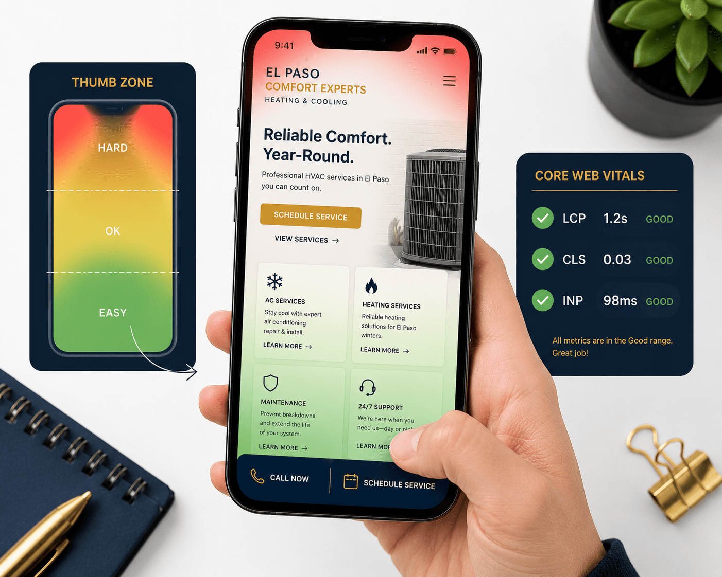
The thumb zone is the area of a mobile screen reachable without hand repositioning during one-handed use — roughly the bottom 40% of the screen. The natural zone (bottom third) sees 96% tap accuracy; the stretch zone (upper corners) sees 61%. Touch targets in the natural zone generate interaction times 267% faster than targets requiring thumb extension. Every primary action — call, book, get directions, submit a form — belongs here, not at the top where it looks symmetrical on a design mockup but costs taps in real use.
Progressive disclosure presents only the information a visitor needs to make the next micro-decision, deferring additional detail until requested. On mobile, where screen real estate is constrained and cognitive load is higher, revealing everything at once overwhelms and loses the visitor. Lead with the essential — the offer, the benefit, the next step — and surface supporting detail through expandable sections, accordions, and progressive loading. Users given one clear thing to focus on engage with it more deeply than users confronted with ten competing elements.
Skeleton loading displays placeholder layout elements — grey boxes where images and text will appear — while actual content loads. Instead of a blank screen or spinner, users see the page structure appearing before content fills in. Users perceive skeleton-loaded pages as faster than spinner-loaded pages even at identical actual load times, because the brain processes structural information as progress. For LCP-challenged pages, skeleton loading is one of the highest-impact perceived performance improvements available without a full technical overhaul.
Bottom navigation places three to five primary navigation items at the bottom edge of the mobile screen — directly in the thumb zone — rather than behind a hamburger icon at the top. Material Design and Apple's Human Interface Guidelines both recommend this pattern for mobile interfaces. Hamburger menus hide navigation and reduce discoverability; users who cannot find their destination within seconds abandon the session. Bottom navigation keeps primary destinations permanently visible and places the most-used paths directly under the thumb.
Tap-to-call makes the phone number the primary CTA rather than a form submission, implemented as a tel: link that triggers an immediate call on tap. Phone calls convert to customers at 30–50% higher rates than form submissions for local service businesses. A visitor ready to call is the highest-intent visitor on your site. Every design decision adding friction between that intent and the dial tone costs a customer. On mobile, that friction is usually placement — the phone number buried in the footer, formatted as non-clickable text, or hidden behind a contact page.
tel: link, minimum 48×48px, labeled with a verb: "Call Now," "Call for a Free Estimate" — not just the number string. This single implementation decision is the highest-ROI pattern change available for any service business relying on phone leads.Vertical-first image composition designs photography and graphics in portrait orientation (9:16 or 4:5 ratio) so hero images and visual content display without cropping on mobile screens. Over 70% of mobile users hold phones in portrait orientation during browsing. Landscape-designed hero images on portrait screens lose their focal point to cropping — the face, the completed project, the before-and-after — eliminating the trust signal the image was chosen to provide. A desktop hero of a contractor's completed kitchen becomes a partial wall on a phone screen.
Single-field form entry breaks multi-field forms into one-field-per-screen sequences or reduces the initial contact form to the single minimum field required — typically a phone number or email address. Every additional form field reduces mobile conversion rate. Reducing a form from five fields to three consistently increases conversions by 25–50%. On mobile, the cognitive and ergonomic cost of typing is significantly higher than on desktop. The pattern acknowledges this reality: ask for less first, collect more in the follow-up conversation.
The 10-Point Mobile First Web Design Self-Audit for El Paso Businesses
Score your current mobile experience against the patterns above. Award one point for each item your site currently implements correctly. Run this audit on your phone — not your desktop — with the site loaded fresh on a real device.
tel: link that opens the phone dialer on tap — not static formatted text that requires copying.
How Mobile First Web Design Patterns Apply by El Paso Business Type
The pattern catalog applies universally, but implementation priority varies by business type and primary conversion event. Here is the fastest path for the three most common El Paso service categories.
Healthcare and dental practices. Priority order: Tap-to-Call (appointment bookings are phone-driven), Thumb Zone Architecture (schedule button placement), Progressive Disclosure (treatment information depth), Single-Field Form (new patient intake friction). The primary mobile conversion event is a booked appointment — every pattern decision protects and accelerates that single path to the phone or booking system.
Home services (HVAC, plumbing, roofing, electrical). Priority order: Tap-to-Call (emergency and estimate calls), Sticky Bottom CTA (free estimate offer), Vertical-First Image Composition (before/after project photography), LCP optimization (photo-heavy service pages). Speed and call accessibility dominate — a visitor with a burst pipe or a broken AC unit in El Paso's summer heat is not waiting three seconds for a hero image to load.
Legal and professional services. Priority order: Thumb Zone Architecture (consultation CTA reach), Bottom Navigation Bar (practice area discoverability), Progressive Disclosure (case type and outcome information), Single-Field Form (initial consultation request friction). Trust and accessibility of the next step dominate — the visitor needs to believe in the firm and find the call button without friction in the same session.
See VenPro Web Design Case Studies →Frequently Asked Questions
Q1 What are mobile first web design patterns in 2026? +
Q2 Why do mobile first design patterns matter for local SEO in El Paso in 2026? +
Q3 What is the thumb zone and why does it matter for mobile web design? +
Q4 How do I test my El Paso business website's mobile performance against these patterns? +
Q5 What does a mobile first web design project cost for an El Paso small business in 2026? +
Your Mobile First Web Design Patterns Audit Starts Here
The gap between a mobile experience that converts and one that loses visitors is rarely a complete redesign. It is usually three to five pattern decisions implemented incorrectly — a CTA in the stretch zone instead of the thumb zone, a five-field form where one field would do, a phone number that does not tap to call, a hero image that loses its focal point on a portrait screen. The 10-point checklist in this post gives you the audit framework to find those gaps on your own site before they cost another month of mobile conversion leaks.
At VenPro Solutions, mobile first web design is the foundation every site we build for El Paso brands is engineered on — high-converting, Core Web Vitals-optimized, thumb zone-architected, tap-to-call-enabled websites built for the customers who are actually searching for you: on their phones, in El Paso, right now.