


Conversion Focused Landing Page Examples 2026: What Actually Works (And Why)
The best conversion focused landing page examples of 2026 share one thing in common: they were built around a single goal, a single audience, and a relentless commitment to removing every obstacle between the visitor and the next step. You've seen the lists — 30 examples, 40 screenshots, Shopify's CTA button analyzed to death. What most of those guides skip is the why. This post breaks down the principles behind pages that actually generate leads, pairs them with current benchmark data, and shows you what to do with that information when you're building for a real business with real revenue goals.
What Makes a Conversion Focused Landing Page in 2026?
Why Most Landing Pages Underperform — Even in 2026
Ad costs are rising. Users scroll faster, trust less, and decide in seconds. And yet, most landing pages are still designed to impress rather than convert. Beautiful hero images. Clever taglines. Subtle animations. Meanwhile, the visitor still doesn't know what they're being asked to do — or why it's worth doing.
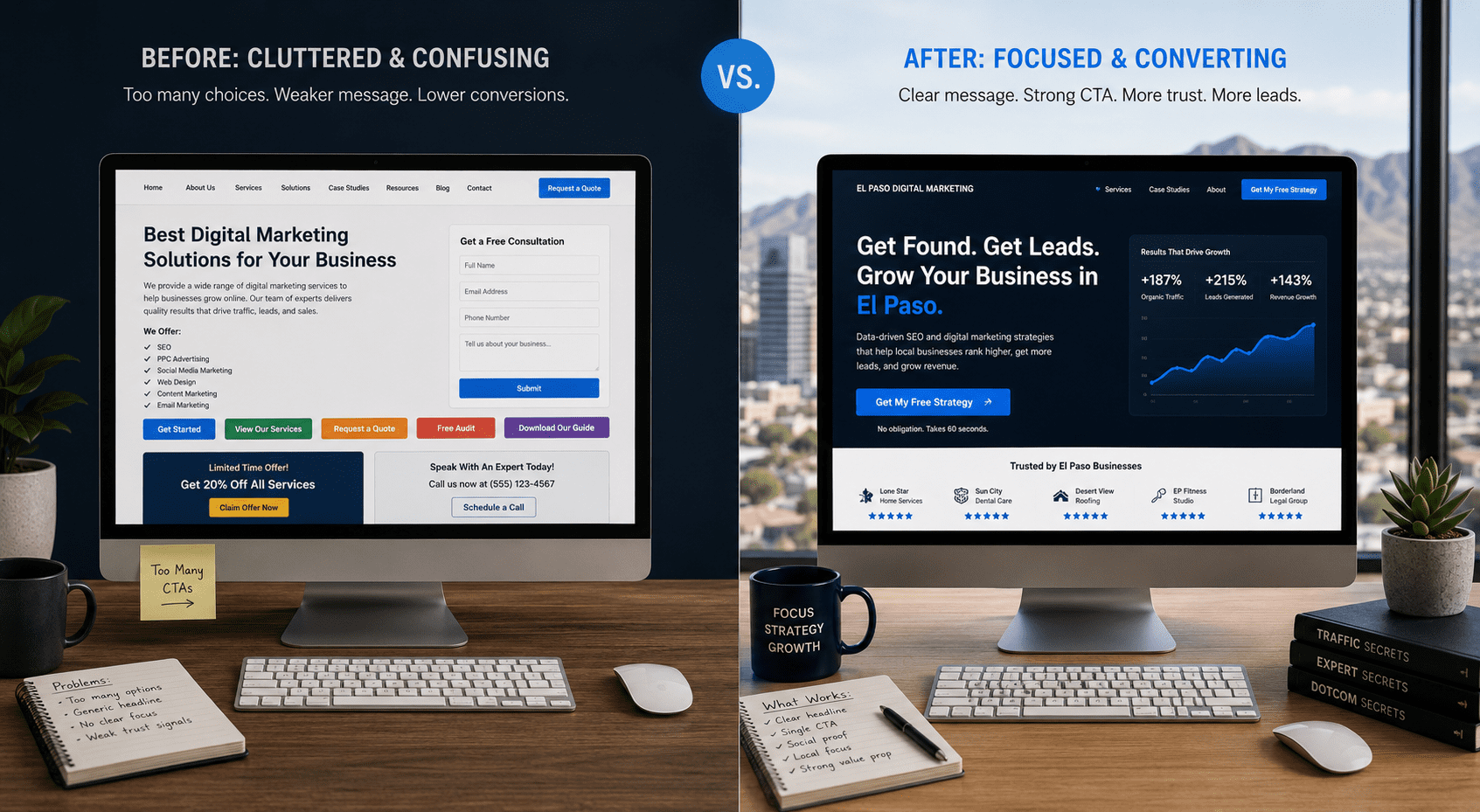
The pages that struggle share a consistent pattern: they were built to look good in a portfolio, not to guide a decision. Multiple CTAs compete for attention. Value propositions are buried below the fold. Forms ask for seven fields when two would do. Each of these is a friction point, and friction kills conversion.
The pages that win do the opposite. They're ruthlessly clear. The offer is front and center. The next step is obvious. Social proof appears before the visitor has to scroll. According to Unbounce's Conversion Benchmark Report, the top 25% of dedicated landing pages convert at 11.45% or higher — roughly 2–3x the cross-industry median. That gap is almost never explained by budget or platform. It's explained by focus, message match, and friction reduction. Three things any business can control.
2026 Landing Page Conversion Rate Benchmarks at a Glance
Understanding where your page stands requires the right baseline. Here's a consolidated view built from Unbounce's analysis of 464 million visits across 41,000 landing pages, supplemented by Foundry CRO and Apexure's 2026 industry datasets.
| Industry | Median Rate | Top 25% | Top 10% | Primary Driver |
|---|---|---|---|---|
| Events & Entertainment | 12.3% | 20%+ | 30%+ | Urgency + clear intent |
| Home Services (Local) | 8.5% | 14%+ | 20%+ | Local trust signals + phone CTA |
| Financial Services | 8.4% | 15%+ | 22%+ | Credibility + risk reduction |
| Lead Generation | 9–12% | 18%+ | 25%+ | Offer clarity + form simplicity |
| B2B Services | 4–6% | 10%+ | 15%+ | Message match + social proof |
| SaaS / Technology | 3.8% | 8%+ | 12%+ | Free trial friction reduction |
| Cross-Industry Median | 4–6.6% | 11.45%+ | 15%+ | Focus + speed + single CTA |
Conversion Focused Landing Page Examples: 7 Principles in Action
Each example below is drawn from a brand consistently cited in 2026 CRO research. The goal here isn't to admire the design — it's to name the specific principle at work so you can apply it immediately.
1. The Problem-First Hero — Why Calm Converts Without Listing Features
Calm's landing page leads with the emotional outcome — better sleep, reduced anxiety — before mentioning a single feature. The headline doesn't describe a meditation app. It describes what the visitor wants to feel. That distinction matters more than most marketers realize.
Benefit-driven headlines consistently outperform feature-focused ones because they eliminate the mental translation step. Visitors don't have to decode "500 guided meditations" into "this will help me sleep." Calm does that work for them — and conversion follows.
Apply it: Rewrite your hero headline to lead with the outcome your customer is actually buying, not the service you're delivering. "More leads from your website" converts better than "conversion-focused web design."
2. The Single CTA Rule — What Shopify Gets Right That Most Sites Ignore
Shopify's free trial page has one button. Not two. Not a secondary "learn more" link. One action, repeated at logical scroll intervals, with consistent copy throughout. The result is a page where the decision is simple because there's only one decision to make.
This aligns directly with Hick's Law: more choices produce slower decisions. On a conversion focused landing page, a second CTA doesn't offer flexibility — it introduces hesitation. Every top-performing page in 2026 CRO research uses a single primary action with secondary options reserved for mid-funnel nurture flows.
Apply it: Audit your page for CTA count. If you have more than one primary action, identify the highest-intent option and remove the rest. You can always nurture the others via follow-up email.
3. Social Proof Placement — The HubSpot Stack That Reduces Perceived Risk
HubSpot's demo request pages layer trust signals in a deliberate order: customer logos appear above the fold, followed by a specific stat, followed by a short testimonial from a recognizable company — all before asking for any information. The sequence matters as much as the content.
Logos work on fast pattern recognition. Stats build credibility. Testimonials create emotional resonance. Deploying them in that order respects how visitors actually process information. Moreover, industry data shows that moving your strongest trust signal above the form can lift conversion rate meaningfully — particularly for service businesses where perceived risk is high.
Apply it: Don't bury testimonials at the bottom of the page. Your most compelling social proof — a client name, a result, a recognizable logo — belongs within the first scroll.
How to Diagnose Your Own High Converting Landing Page in 5 Steps
Before redesigning anything, run this five-point audit. It takes less than 20 minutes and will identify the highest-leverage fix available on your current page.
- The 5-Second Test. Show your page to someone unfamiliar with your business. Can they identify your offer, your audience, and your CTA in five seconds? If not, your headline is doing too much work — or not enough.
- The Single CTA Audit. Count your calls to action. If you have more than one primary action competing for attention, you have a conversion problem waiting to happen.
- The Trust Signal Scan. Are your strongest testimonials and credibility markers above the fold? Or are they sitting below sections your visitors may never reach?
- The Form Field Count. How many fields are you requiring? Research consistently shows that reducing a form from five fields to three can increase conversions by 25–50%. Every field you remove is a friction point eliminated.
- The Message Match Check. Does your landing page headline match — word for word — the ad, email, or search result that sent the visitor there? Even a small language gap creates doubt. Industry data from conversion research confirms that traffic source alignment often impacts conversion more than page design itself.
How to Choose the Right Landing Page Strategy for Your Business
Not every business needs the same approach. The right conversion focused landing page strategy depends on your sales cycle, your audience's awareness level, and how much friction is appropriate for your offer. Here are the three questions that matter most.
Is your visitor problem-aware or solution-aware? A visitor who already knows they need a landing page designer needs less education and more specificity. A visitor who's just realized they're losing leads from their website needs context first. Your page structure — and the length of your copy — should reflect which stage your traffic is coming from.
What's the one action you want them to take? Not two. Not "call us or fill out the form or learn more." One. If you can't name the single most valuable action for a given page, the page isn't ready to convert anyone. Every high converting landing page example in 2026 is built around a single, clearly defined conversion event.
Does your local market require different trust signals? For El Paso businesses, a testimonial from a recognizable local brand carries more weight than a Fortune 500 logo. Phone numbers should be prominent and click-to-call enabled. CTAs should reflect your actual sales process — "Schedule a Free Consultation" or "Get a Same-Day Quote" — rather than generic SaaS-style copy like "Start Your Free Trial."
The goal isn't to replicate Stripe's landing page. It's to apply the same principles — clarity, specificity, trust, single focus — to a page that converts your specific audience in your specific market. That's where a conversion focused landing page built for El Paso looks different from one built for a national SaaS brand, and why that difference is a competitive advantage.
See VenPro Case Studies →Frequently Asked Questions
Q1 What should a conversion focused landing page include? +
Q2 What is a good landing page conversion rate in 2026? +
Q3 How many CTAs should a high converting landing page have? +
Q4 Does landing page design matter more than copy for conversion rate optimization? +
Q5 What landing page best practices are most important for local service businesses in El Paso? +
Your Conversion Focused Landing Page Should Be Working Harder
The best conversion focused landing page examples of 2026 all share the same DNA: one goal, one audience, one clear next step, and enough trust signals to make that step feel safe. The brands getting it right aren't always the biggest ones — they're the most disciplined about removing everything that isn't directly serving the conversion.
If your current landing page is generating traffic without generating leads, the fix is rarely a full redesign. It's a refocus. And that starts with understanding which elements are working, which aren't, and what your page's one job actually is. At VenPro Solutions, we build conversion focused landing pages for El Paso businesses — pages engineered around your audience, your sales process, and your growth goals, not just what looks polished in a portfolio. Our clients have seen results like 13.1x click growth because we align every design decision with measurable outcomes from day one.