





Mobile First Web Design for Small Business
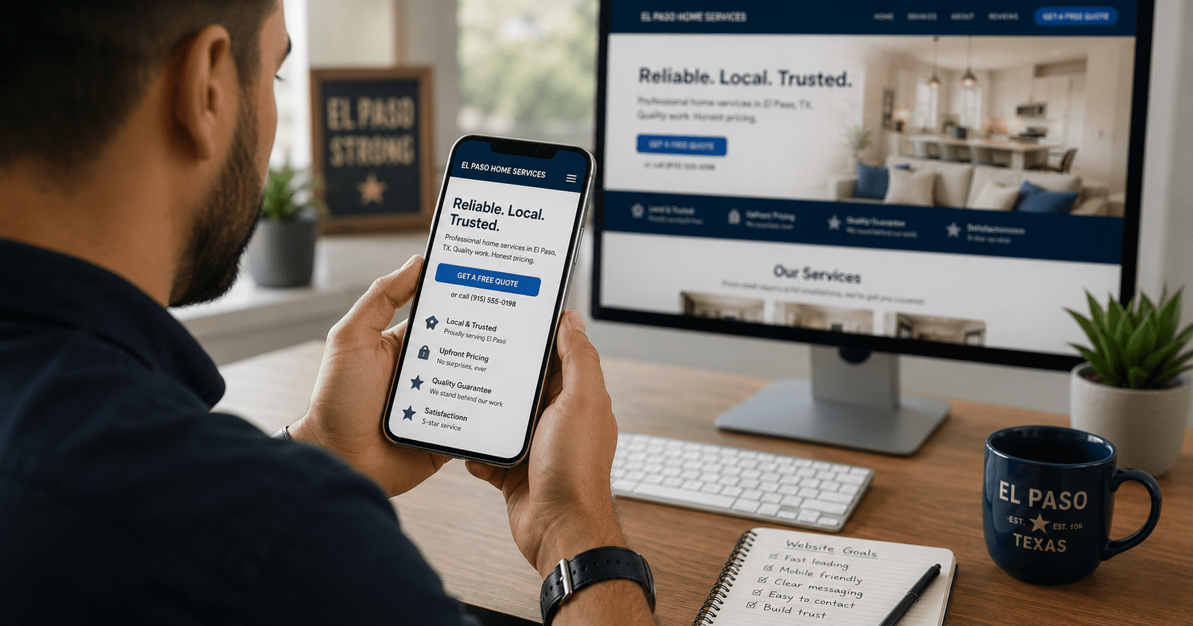
Mobile first web design for small business means building the phone experience first because that is where most customers start. Specifically, visitors search, compare, read, and decide from small screens every day. If your website is hard to use on mobile, leads leave before they understand your offer. Therefore, a mobile-first website is not a design trend. It is a practical conversion strategy.
Mobile First Web Design for Small Business: The Simple Answer
Why Mobile First Web Design for Small Business Matters
Most websites are not failing because they look outdated. Instead, they fail because they were built for the wrong device. Specifically, many sites still begin with a desktop layout and treat mobile as a later adjustment. As a result, the mobile experience becomes slower, crowded, and harder to use.
Furthermore, small business customers often make quick decisions. They search from their phones, compare nearby businesses, scan reviews, and look for the next step. Therefore, every mobile page needs clear messaging, fast loading, readable text, and easy tap targets. If those basics are missing, the visitor may never reach the contact form.
A mobile-first approach also supports SEO and conversions at the same time. Google evaluates the mobile version of a site through mobile-first indexing, so your phone experience directly affects visibility. For a deeper look at search performance, explore VenPro’s SEO service.
Mobile First vs Responsive vs Desktop First at a Glance
These approaches sound similar, but they are not the same. Specifically, mobile-first starts with user behavior. Responsive design adapts to screen sizes. Desktop-first starts large, then compresses the experience later.
| Approach | What It Means | Pros | Cons | Best For |
|---|---|---|---|---|
| Mobile-first | Designed for phones first, then scaled up | Better speed, UX, and conversions | Requires planning | Growth-focused businesses |
| Responsive | Adapts layouts to different screen sizes | Flexible across devices | Often desktop-first underneath | General use |
| Desktop-first | Built for desktop, then adjusted for mobile | Easy initial setup | Poor mobile experience | Outdated websites |
| Mobile-optimized | Improves mobile after launch | Can fix visible issues | May not solve structure problems | Short-term fixes |
| Conversion-first | Designs around actions and leads | Clear user path | Needs content strategy | Service businesses |
Mobile First Web Design for Small Business and SEO
Mobile-first design can improve SEO because it aligns with how Google evaluates websites. Specifically, Google uses mobile-first indexing, which means the mobile version of your site is the primary version used for indexing and ranking. Therefore, a weak mobile experience can hold back search visibility.
Speed also matters. Mobile users are less patient with slow pages, heavy images, and unnecessary scripts. Additionally, slow pages can reduce engagement and increase bounce rates. Tools like PageSpeed Insights can show performance issues that affect real users.
However, SEO is not only technical. Mobile content must also be easy to scan. Headings should be clear. Calls to action should be visible. Furthermore, service pages should match what customers search for. For broader website strategy, see VenPro’s web design service.
Mobile First Web Design for Small Business and Conversions
Mobile design impacts conversions because usability drives action. Specifically, users need to read, navigate, tap, and contact you without friction. If buttons are too small, menus are confusing, or forms are hard to complete, visitors leave. Consequently, even strong traffic may produce weak lead numbers.
Mobile-first websites reduce that friction by focusing on what users need first. The offer appears quickly. The layout stays simple. The CTA is easy to find. Additionally, forms use fewer fields and work well with thumbs. As a result, visitors are more likely to call, book, or request a quote.
The best mobile experience also supports trust. Reviews, proof, service details, and contact information should be easy to find. By contrast, hiding important details behind clutter creates doubt. In short, a better mobile experience helps people feel confident enough to take the next step.
Mobile First Web Design for Small Business Mistakes
Many mobile websites still struggle because they try to fit too much content on small screens. Specifically, long blocks of text, crowded menus, oversized images, and unclear CTAs make the page feel heavy. Therefore, the first fix is usually simplification.
Buttons are another common issue. If users cannot tap a button easily, they may not take action. Likewise, text that requires zooming creates frustration. Additionally, slow load times can make visitors leave before the first section even appears.
The solution is to prioritize. Put the main offer first. Keep navigation short. Use readable text. Compress images. Finally, make the next step obvious on every important page. For real examples of strategy-led builds, visit VenPro’s project portfolio.
What Happens If Your Website Is Not Mobile-Friendly?
A website that is not mobile-friendly loses traffic, trust, and conversions. Specifically, users may leave quickly because the page is hard to read or navigate. As a result, bounce rates rise and lead opportunities drop.
Search visibility can also suffer. Google’s documentation explains that mobile-first indexing uses the mobile version of a site for indexing and ranking. Therefore, the mobile version should contain the same important content, structured data, and usability signals as the desktop version. You can review Google’s guidance on mobile-first indexing.
In short, mobile is no longer optional. It is the default customer experience. If your website fails there, it is already behind competitors that make phone users the priority.
How to Make Your Website Mobile-First
Start with the smallest screen first. Specifically, decide what a phone user must see, understand, and do in the first few seconds. Then remove anything that distracts from that path. This keeps the page focused on real customer behavior.
Next, improve speed, simplify navigation, and make calls to action easy to tap. Additionally, test every important page on an actual phone. Do not rely only on desktop previews. Finally, check whether forms, menus, buttons, images, and text work cleanly without zooming.
See the web design service →How to Know If Mobile-First Is the Right Fix
Not every website problem requires a full rebuild. However, mobile issues often reveal deeper strategy gaps. Specifically, if the site is hard to use on phones, it may also have unclear messaging, weak structure, and poor conversion flow.
Does the site load fast on mobile? If it takes more than a few seconds, speed should be a top priority.
Can visitors act without zooming or searching? If not, simplify navigation, enlarge tap targets, and move CTAs into visible positions.
Does the mobile page explain your offer quickly? If users cannot understand the value in seconds, rewrite the first screen and headings.
Ultimately, mobile-first is the right fix when your website looks acceptable on desktop but performs poorly where customers actually browse. Therefore, diagnose the phone experience before changing colors, plugins, or extra features.
Start a strategy call →Frequently Asked Questions
Q1 What is mobile first web design for small business? +
Q2 Does mobile first design improve SEO rankings? +
Q3 Is responsive design the same as mobile-first design? +
Q4 Why is my website not working well on mobile? +
Q5 How can I optimize my website for mobile users? +
Ready to Build a Website That Converts on Mobile?
Understanding mobile first web design for small business is one thing. Executing it correctly is another. Specifically, your website needs speed, clarity, SEO structure, and conversion strategy working together. Therefore, VenPro builds websites that start with the mobile experience and scale into real business growth.